Nordstrom Website | A Relaunch Ten Years in the Making

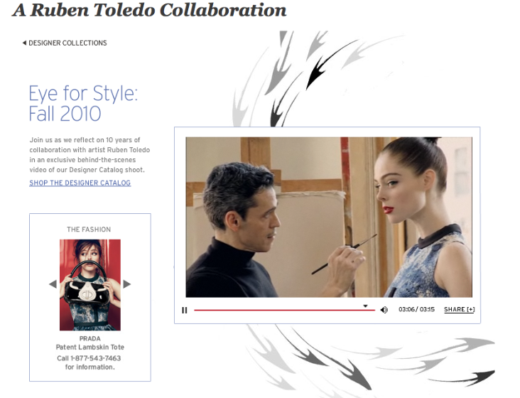
Nordstrom relaunched its website this afternoon with a new interface that aims to enhance and simplify the online shopping experience. With improved navigation and interactivity, a new social media component that allows shoppers to comment and add favorite items to comment pages, the new nordstrom.com, is a big improvement over the old site. The company plans to to launch local-focused features on the website. According to Women's Wear Daily, this will include videos of designer appearances, and conversations among customers, store managers and sales people on topics such as fashion trends or best sellers.
“Our number-one goal is to improve service,” said Jamie Nordstrom, president of Nordstrom Direct. “It’s really tied to everything we do. We know the better service we give, the more [consumers] spend with us. We have the luxury of being able to invest in our business. We are continuing to invest in new capabilities. We spent the last five years more on the back-of-the-house. Going forward, it will be more about customer-facing initiatives.”
We like the newly streamlined Nordstrom.com. With just three tabs, Nordstrom's new site is extremely easy to navigate. The shopping experience is faster but we love the "Conversation" tab, which has designer interviews, with the first being an in-depth interview with Nordstrom's collaboration with Ruben Toledo, interviews with customers on their style as well as a wedding section that allows users to submit their story and photos of their big day.


